Teacher Demonstration
Use the live model as a shared screen demonstration before students try their own predictions and observations.
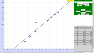
Use Data Fitting to fit a polynomial curve to x-y data points, adjust parameters, compare with Best Fit, and judge fit quality from visible residuals or mismatch.
Use the live model as a shared screen demonstration before students try their own predictions and observations.
Open the simulation, adjust the controls, and compare what changes on screen before answering the concept-check questions.
How well does the polynomial curve fit the plotted x-y data, and what evidence shows whether the fit is good enough?
Identify what x and y represent on the graph, including units where the data context provides them.
Click or inspect points on the plotting panel and look for the overall trend, scatter, outliers, or curvature.
Change one parameter such as a, b, c, d, or e at a time and observe how the curve moves relative to the data.
Use the Best Fit result as a least-squares benchmark, then discuss where your curve matches the data and where residuals remain.
Use this as a modelling cycle on an x-y graph: data first, curve choice second, fit quality last. Students should explain how the curve is supported by the plotted points.
Ask: Which axis is x and which is y? Which points pull the curve most strongly? What changes when one polynomial parameter is adjusted? Where is the largest mismatch between point and curve?
Have students make a manual fit before pressing Best Fit. Then ask them to compare the two curves and describe the residuals or visible gaps rather than simply accepting the computed answer.
The source procedure states that users add points in the plotting panel, adjust polynomial parameters a to e, and use the Best Fit button to compare with a least-squares approximation.
These questions are generated from the topic and the concept illustrated by the simulation. Use them after students have explored the model.
Correct first attempts build a streak and unlock higher point multipliers on this device.
1. What should be checked before fitting a curve on the graph?
2. What do the plotted points represent in this activity?
3. What is the purpose of changing parameters such as a, b, c, d, and e?
4. What does the Best Fit button provide?
5. What makes a strong conclusion from this model?
Unlocks after 3 correct concept-check answers on this page.
1. A fitted line has a high gradient but the residuals curve upward then downward. What is the best interpretation?
2. Which conclusion is strongest after fitting data with scatter?
3. Two plausible fitted lines pass through the same data cloud. What should students compare?
4. A y-intercept is non-zero when theory predicts zero. What is the best expert response?
5. Why is a graph useful before calculating a fitted model?
Anonymous activity shows this resource is being discovered, revisited, and used by learners in different places.
Country or region is inferred anonymously from server location headers when available. No names, accounts, or IP addresses are shown.